Font Test ✒
Parent: Absolute 50px
Children size 0.5em
Children size 25px
Children size 1.5em
Children size 150%
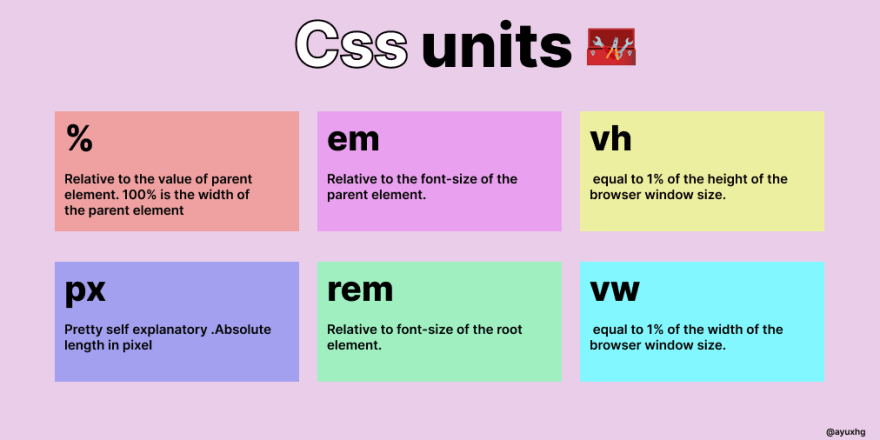
Summary: 1em = 100%
Children size 1rem
Children size 16px
Children size 2.5rem
Children size 40px
Summary: 1rem = 16px
Box Test 📦
Parent: Relatively 100%
Summary: em comes from the printing paper world.
So, em, rem only relates with font size
Summary: we should use px, %, vh/vw for height/width
The min-width and max-width are media features that correspond to a certain media type that has been specified in the media query. The min-width specifies the minimum screen width of a specific device, meanwhile, The max-width media feature states the maximum screen width of a specific device.
The
VW is useful for creating full width elements (100%) that fill up the entire viewport's width. Of course, you can use any percentage of the viewport's width to achieve other goals, such as 50% for half the width, etc. VH is useful for creating full height elements (100%) that fill up the entire viewport's height.
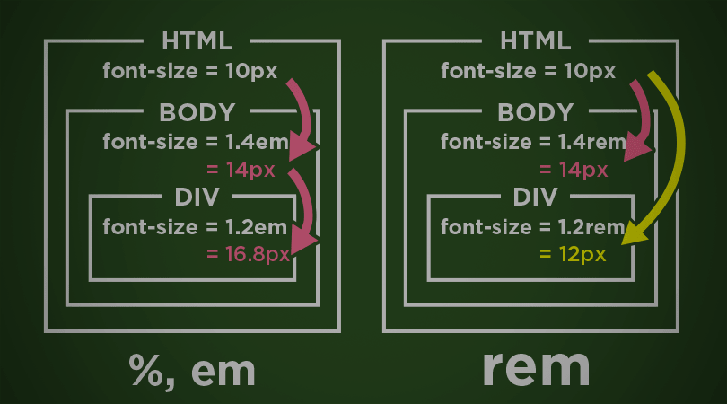
EM is relative to the parent element's font size, so if you wish to scale the element's size based on its parent's size, use EM. REM is relative to the root (HTML) font size, so if you wish to scale the element's size based on the root size, no matter what the parent size is, use REM.